Neutral Paint Colours
Warm neutrals with a touch of yellow or umber
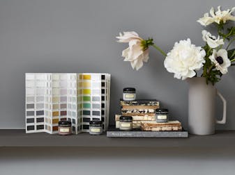
By selecting a neutral with a hint of yellow you bring warmth and peace to a room. It can feel cocooning, modern or classically smart. Based on natural pigments, these neutral paints have been a standard colour in decoration since time immemorial and so come with a provenance that is unrivalled. This natural cosiness, which is at the front-edge of trends in interior design, can be found in Silent White: a neutral paint ideal for living spaces, bedrooms and lounge areas, providing a backdrop with both sophistication and warmth. For a warmer interpretation, try Bath Stone or First Light.
Grey-based neutrals
Grey-based neutral paint colours can make an ideal backdrop for decoration with wall coverings and fabrics, as they allow the decorating accessories to become the star of the show. Choices in this group surround the level of warmth required from the colour. For a warm tone, the ever-popular French Grey has the ability to combine well with other strong colours in a harmonious way - ideally suited for living spaces and bedrooms.
Green-based neutrals
Bringing a dash of green into any scheme by way of a neutral shade adds a softness redolent of natural colours, which are so popular in contemporary decoration. Of particular interest in this group are Portland Stone and Pearl Colour, both of which create a harmonious and relaxing ambience for spaces including nurseries, bedrooms and living spaces. By choosing a green neutral you add warmth without adding significant yellow.
Pink-based neutrals
For pink-based neutral paints, the choice lies between gentle and stronger pink tones. A gentle hint of rouge acts as a neutral shade without strong character, but still acts nevertheless. Choose subtle shades like Rolling Fog (includes red/brown) or China Clay (includes pink/brown). Alternatively, opt for something with a deeper character, in which case Roman Plaster will fit the bill.
Dark Neutrals
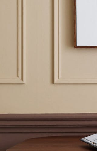
Using deep, dark shades in living spaces creates a dramatic, intimate and cocooning feel. Dark colours like ‘Chocolate Colour’ and ‘Baluster’ make a real statement when used all-over, as they have an innate warmth that makes a space inviting and enveloping without feeling heavy and imposing.
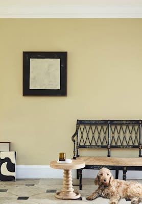
Oak Apple Hallway
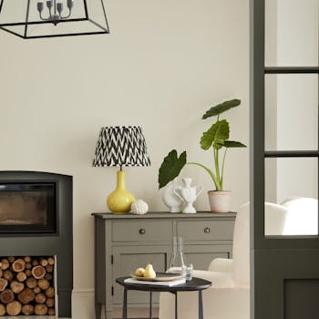
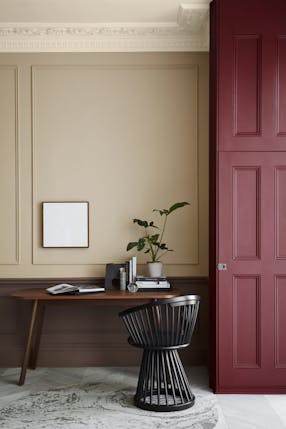
Neutral colours are key to very many schemes because of their ability to calm the mood of a room. Use neutrals in combination with darker versions of the same hue. Or, use neutral paints as a way of complementing a stronger or more vibrant shade – to bring balance and order to a project.
Using the Classic Neutrals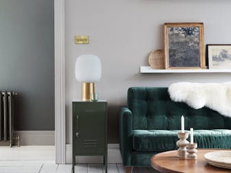
Neutral Inspiration
