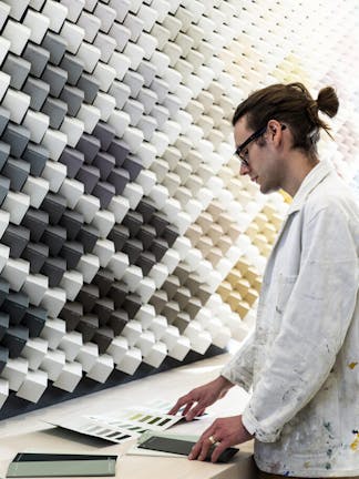
Our Colour Specialist, Simon Hutchinson has a vast knowledge of producing and mixing colours for projects that require a more tailored approach. Using spectrophotometry and a detailed understanding of pigments, he formulates both bespoke colours and colour matches for historic shades.
Here, Simon shares his advice on painting a period property and how to create a beautiful home whilst retaining its history.

What should people consider when embarking on a decorating project in a period property?
One of the most important things when you are starting a project is to make sure you are using the right product. There can often be many pitfalls with ‘older’ houses, especially when it comes to the use of lime in plaster and renders and how to paint over them. It’s always best to get advice before you start the project just to double check.
Also, check if your house is listed or in a conservation area before you begin any exterior paint work. There can often be limitations on the colour and finish you can use so it is good to check this beforehand.

Are there any common mistakes that people make when decorating a period property?
It is quite common to see colours being used on the exterior of a property that aren’t quite in keeping with the age of the house. For example, brilliant white is often used on exterior joinery but really this colour wasn’t available until the 1960s. A softer, more complementary colour to use would be Little Greene’s ‘Lead White.’ This colour was initially matched to lead carbonate which was the primary white pigment used before the turn of the 20th century, it is warmer and softer than a brilliant white so blends really well with traditional stones and bricks.
Black is a colour that is often used on exterior railings and front doors. Prior to the 20th century this colour wouldn’t actually have been used on exterior metalwork. If you have a Georgian property, some different options would be ‘Dark Lead Colour’ and for Victorian buildings, ‘Invisible Green’ or ‘Deep Brunswick Green’ are perfect.

What are some of the key interior design trends from different periods?
A Georgian trend which is still perfect for the contemporary home was the use of ‘common colours’ in the main parts of a house and the use of more expensive colours in the best rooms. For example, you could use a stone colour such as ‘Stone Mid Cool’ in the hallway and corridors with the introductions of ‘Pea Green’ or ‘Light Peachblossom’ in a living room, it certainly gives a nod to Georgian interiors.
During the late Georgian and Regency period, the panelling below a dado rail would often be painted in a natural stone colour such as ‘Stone Pale Cool’ with a contrasting colour like ‘Blue Verditer’ or ‘Yellow Pink’ on the walls above which would create a classic, period feel to a home of that age.
By the Victorian period, interiors had taken on a much more multi influential look due to the availability of exotic artefacts and the mass production of wallpapers. It is certainly an era that we can look to for inspiration and there are some wonderful, rich colours from this period such as ‘Ashes of Roses’ and ‘Brunswick Green’ that give a beautiful eclectic feel.

How important is it to use colours that are in keeping with a building?
One thing to remember when painting a period property is that it is your home and not a museum. It is really important to choose colours that you are naturally drawn to and that you feel comfortable living with every day.
You can really complement a period property by just being sympathetic to the period and architecture. It may be something quite simple like limiting your palette to only a handful of colours or keeping your woodwork in the same colour throughout the house that really draws attention to the natural features within your home.

How do you recreate historic shades?
When matching and recreating historic shades for projects, I need to make sure that the modern colour has the same feeling and response to different lights. With an understanding of the pigments used at the time, these can be paralleled with our modern pigments and I can recreate and match these shades perfectly.
If you think a consultation with Simon may help with your decorating project, find out more about Bespoke Colour Consultancy or email Simon on simon@thelittlegreene.com
Find out more about Colour Consultancy


