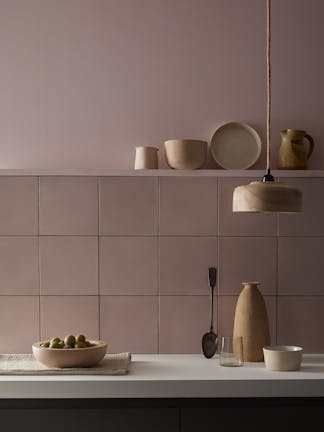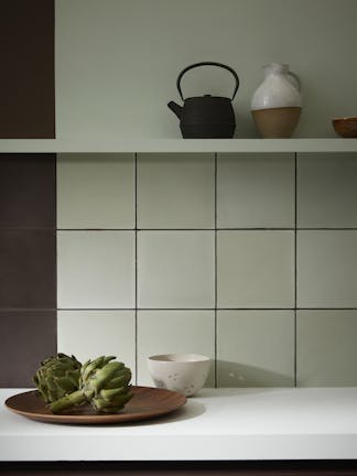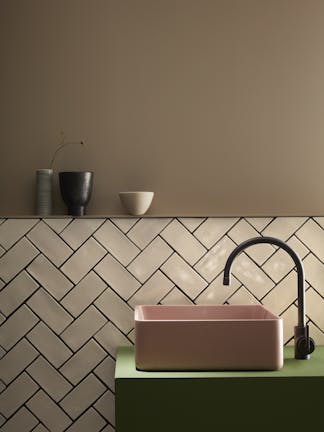
We recently launched a collaboration with Bert & May, creating two tile designs in eight Little Greene shades. Here Ruth Webber, Creative Director at Bert & May, discusses the pairing.

Would you tell us about your position at Bert & May
As Creative Director, I’m responsible for the development of new designs and new colours across our different materials, I have an innate passion for interiors and putting looks and styles together. So, whenever exploring new design ideas they are never created in isolation, they always form part of an interiors look. I find inspiration comes from all over, sometimes it’s beautiful properties and boutique hotels but often it starts with an ambience captured in an image or in architecture new and old! I’m also responsible for making sure our classic designs and colours are well represented.
What’s the ethos of the brand?
We see our brand as more than just tiles. Bert & May has a beautiful palette and strong look, we feel we have an aesthetic and the tiles form only part of that visual conversation. Our ethos stems from the reclaimed finds and the handmade materials we have salvaged over the years, which give texture, layers and an ageless colour palette. We’ve put a lot of time and effort into creating Bert & May’s core palette of colours, inspired by the reclaimed tiles, derived from natural pigments and mixed by hand, all are infused with the soft, warm, timeless tones for which we are known.

Why was Little Greene the perfect brand for this partnership?
Colour is central to everything we do at Bert & May and we’ve worked hard to develop a single underlying palette that covers a broad spectrum while still exuding the chalky qualities and muted tones we’re known for. So to work alongside Little Greene who share the same passion for colour and a similar aesthetic albeit across a wider palette has been a huge honour and pleasure. It's more than just tiles and paint, for us it is the perfect pairing, allowing our customers to buy into an overall look.
What’s your favourite combination from the collaboration?
The Purple Brown and Aquamarine combination. The velvety tones of the Purple Brown paint have a deep and rich feel, the way this colour has been interpreted in our tiles adds a softer layer to a bold colour. It gives a chalky appearance, with faded nuances across each tile, it adds a layered look to compliment the solid paint colour. Then, add to this the soft pastel Aquamarine, it's just beautifully unexpected!

When creating a scheme for a bathroom or kitchen, which element should you pick first?
Start with a colour and build from there, thinking about your own personal style. If you are unsure, sometimes it works to look at your wardrobe, do you love pattern and print and bright colours, do you love colour blocking or do like to keep it simple and neutral? This often translates in to your interior style.
Could you tell us about some recent bathroom trends?
We are seeing a move towards more striking and brave colour choices. Embrace a stronger palette, keep the design simple and let the colours do the talking.
Find out more about the Bert & May x Little Greene collaboration, or shop the range at www.bertandmay.com


