
Designed to make choosing colours a pleasure and intuitive for the user, Little Greene’s two colour cards bring together the best of its capsule collections, showcasing 196 Little Greene colours in a new format, presented together, providing a refined and refreshed ‘Colours of England’ collection alongside an expanded range of graduated shades in the ‘Colour Scales’ offering.
With confidence in colour central to the Little Greene ethos, the cards span over 300 years of historic interior design and include many authentic 18th, 19th and 20th century shades. These historic colours are presented alongside a carefully adjusted palette of contemporary shades, embracing modern interior design aesthetics and current decorating trends.
The ‘Colours of England’ card has been updated to meet the growing desire for classic, timeless colours that are both simple to choose and a joy to live with. The collection includes many significant shades from all over the British Isles that have contributed to the internationally renowned style of ‘English Interior Design’.

Ruth Mottershead, Marketing Director comments, “Alongside the cherished Little Greene signature colour palette, it is wonderful to be able to introduce colours that celebrate the desire for warmth and joy such as ‘Indian Yellow’ named after the traditional oil pigment used by fine artists, ‘Bassoon’ with its deep-ochre undertone, and ‘Giallo’, an uncompromising, yet very easy-to-use, burst of golden sunshine. These bold and charming yellows illustrate our desire to return to warmth without regressing to cream. The punchy yellows are accompanied by a host of colours that include gentle powdery pink ‘Masquerade’, rich and charismatic charcoal grey ‘Vulcan’, the beautiful and inviting mid-strength blue ‘Etruria’ and ‘Silent White’- the answer to the everlasting quest for the perfectly balanced, calming and elegant neutral-warm white.”
The extended ‘Colour Scales’ colour card, offering a further eight families of diluted iconic Little Greene colours, and incorporating the ‘Stone’ and ‘Grey’ capsule collections, is a response to the increasing desire for easy and simple-to-scheme colours that create harmonious and monochromatic backdrops to decoration. The ‘Colour Scales’ card also includes deeper colours alongside the ever-popular diluted shades, as useful identifiers for the undertone of each colour family.
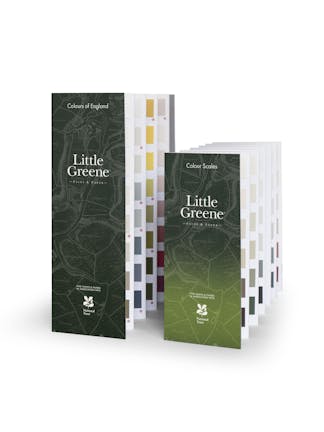
The card has been designed for ease of use, each colour is one of a graduated family, grouped in columns according to undertone. Shades within the same column can be used together for tonal coordination, or across columns to create a balanced contrast.
Ruth Mottershead continues: “The neutral trend for 2021 continues subtly away from cold greys and traditional country creams, towards neutral stone tones, complex greys and nature’s favourite; green. By providing these soft tonal colours in families we can offer a subtle spectral range that consumers can combine with confidence. The lightest four shades work beautifully to add discreet depth to a room, softly defining characterful architectural features, or reducing the contrast of walls and ceilings which might be subjected to different light levels. The deeper shades can be used to complete a coordinated, harmonious scheme that, whilst monochromatic in hue, makes a strong statement with an expansive depth of colour.”
40 of the most popular shades appear on both cards, providing customers the opportunity to see these exceptional shades in different environments, each illustrating how the colours work in a coordinating and harmonious, or dynamic and diverse way.
Colours
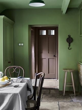
'Garden'
This reduced version of George Bernard Shaw’s ‘Hopper™ 297’ brings a fresh ambience of midsummer itself.
Find out more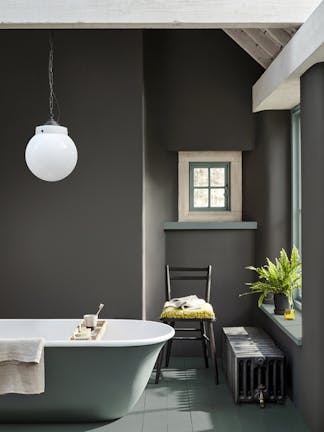
'Vulcan'
Sharing its name with the Roman God of Fire, this shade is inherently strong; a deep, charismatic, charcoal grey - with a little warmth retained.
Find out more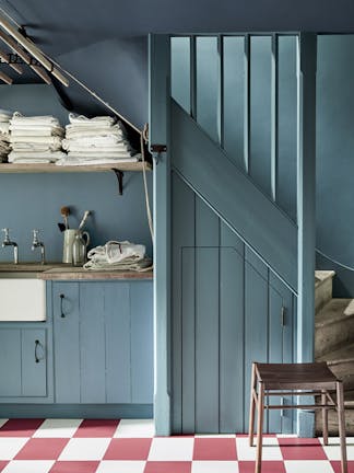
'Etruria'
Historical innovator and renowned potter Josiah Wedgwood named his Staffordshire ceramic factory ‘Etruria’ in 1769. The title was a tribute to his passion for the forms, colours and decoration of ancient Etruscan and Greek pottery, which he expertly recreated and brought to English high society in the late 18th century.
Find out more
'Obscura'
An elegant, gentle blue-grey, this shade sits effortlessly in the tail of the Gauze Colour Scales family. Equally elegant used in solitude as among the lighter Gauze shades, this cool neutral works beautifully with natural floor textures; sisal, coir and jute.
Find out more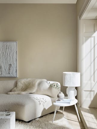
'Silent White'
Formulated in the quest for the perfectly balanced, neutral-warm white for a calm interior. Add softly spoken depth to the room by using its lighter and deeper versions on other walls, the ceiling and trim.
Find out more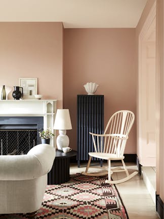
'Masquerade'
With its delicate, powder-like hue, Masquerade – alongside the diluted versions of it – offers an alluring, natural undertone that is as ‘at-home’ in the bedroom as in the ballroom.
Find out more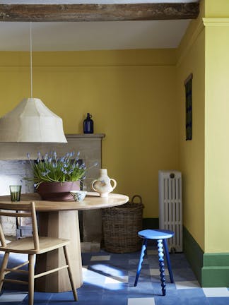
'Indian Yellow'
Between the sixteenth and nineteenth centuries, the pigment Indian yellow was a much more prolific ingredient in the oil paint of fine artists, than in the decorative paints of the time. Our colour shares all
the timeless qualities of its namesake, but thankfully none of its well documented original ingredients or production methodologies.
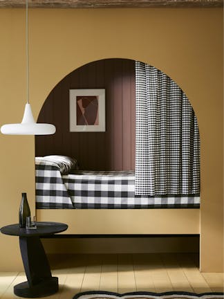
'Bassoon'
With its deep-ochre undertone, Bassoon is an unsung hero of historical decoration. These drab colours were favourites in the functional ‘back of-house’ areas of yesterday’s grand homes due to their ability to disguise dirt, and the subsequent infrequency with which they needed to be repainted.
Find out more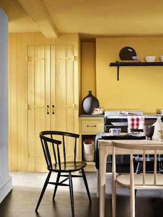
'Giallo'
In celebration of the Italian influence on British architecture and interior design over the last 400 years, Giallo is an uncompromising, yet very easy-to-use, burst of golden sunshine. A charming highlight or accent colour, it is most splendid when used in a large expanse.
Find out moreClick here for more inspiration and to order a colour card.


