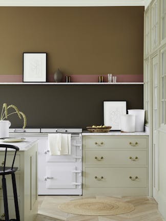
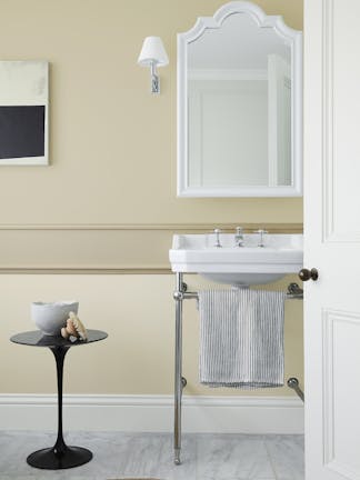
Ahead of the launch of our new capsule, 'Stone,' our Creative Director, Ruth Mottershead explores using warm, more natural neutral tones in the home.

'We’re experiencing a real shift away from the cool, blue toned greys that have been so popular in recent years. A clear transition to warmer, natural neutrals is taking place with consumers opting for earthier tones that have an inherent warmth to them such as 'Travertine' and ‘Lute’.'

'With many of us spending an increased amount of time indoors, our homes are becoming spaces to relax and retreat. More than ever, there is a greater need to surround ourselves with comforting, soothing colours that are not only easy to live with but provide warmth and serenity within our living environments.'
'This trend for warmer tones can be incorporated into both contemporary and traditional homes, as well as bold or softer, paired back design schemes.'

'For a more traditional stone-based design scheme, pair ‘Travertine’ with a lighter tone that has the same base pigment such as ‘Travertine Light’. Whilst you will benefit from a slight change in tone, the overall look will be harmonious, tonal and calming with added depth.

To add more drama to an interior, opt for contrasting colours such as ‘Nether Red’ and ‘Book Room Green,’ or go for an almost monochrome feel with ‘Pompeian Ash,’ paired with ‘Lute’ and create a colour highlight with pops of bright red in your home furnishings and fabrics.'

'Natural stone tones aren’t just about the more obvious sand shades, but also incorporate soft reds and muted greens. Green is the true colour of nature, one that we feel comfortable within the home. It is a shade that we associate with the tranquillity of the outdoors. Using variations of greens in graduated tones will tie the scheme together, but also give the illusion of texture due to the subtle shift in hue. The variations of the new muted ‘Green Stone’ show how greens can be layered to create a serene space that is reminiscent of our natural surroundings.'
'Soft muted greens ‘Green Stone Light’ and ‘Green Stone’’ work beautifully when paired with earthier tones such as ‘Book Room Green’ or ‘Sage Green.’ By using these traditional muted green tones in combination, you can create a scheme that emulates the natural environment, delivering a feeling of restfulness and wellbeing: this makes these colours perfect for spaces used for relaxation like bedrooms, bathrooms and living spaces.'


